Trends - Page 10

Stay on top of the latest design trends, see what’s popular, and learn how to create design work that feels modern, current, and up-to-date.

Duotone Color: Tips & Examples for This Vibrant Trend

Graphics / 28 Sep 2016

Duotone Color: Tips & Examples for This Vibrant Trend

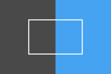
The next big web design image trend is here, and it’s vibrant, colourful, and beautiful!

Thanks to Spotify, duotone is growing in popularity almost daily. The effect, which uses a pair of colors over a photo is striking, fun and vibrant. It’s also quite trendy, with new sites changing to a duotone format almost daily. Here are a few ways to make the most of this hot design technique.

Design Trend: What’s Up With All Those Tiny Corner Logos?

Graphics / 19 Sep 2016

Design Trend: What’s Up With All Those Tiny Corner Logos?

Have you noticed how small logos seem to be increasingly popular on websites? For a while, it seemed the focus in design was to “make it bigger.” That has shifted — in terms of logo size and placement anyway.

The biggest trend in website design right now is the use of the tiny corner logo. We’re going to break down the trend and look at a few great examples. Maybe you’ll find the inspiration to shrink the logo in your next project. Or maybe you’ll decide to keep it big and bold!

3 New Logo Trends to Try for Your Brand

How to Design a Logo / 25 Jul 2016

3 New Logo Trends to Try for Your Brand

We all know the story. You spend a lot of time perfecting the perfectly trendy design element… and then, just like that, the trend is over. And your cool design goes with it. But it doesn’t have to be that way.

The trick to designing around trends is speed. To make the most of an emerging trend, you need to get from concept to deployment quickly. The second trend trick is to use trends that aren’t “too trendy,” meaning they pull from classical design elements.

Today, we’re going to look at three logo trends that you can start using right away. Done well, they should also have a lot of staying power because they use some more timeless concepts from design theory.

Design Trend: Incorporating Whimsy

Graphics / 27 Jun 2016

Design Trend: Incorporating Whimsy

Whimsy: capricious humor or disposition; extravagant, fanciful, or excessively playful expression. Adding a touch of whimsy to a project is an easy, and fun, way to lighten up the mood of the design.

From small elements to a full-scale whimsical design, these touches can draw in users because of their simple charm. Whimsy is most often associated with more feminine projects and common for designs that focus on children, but that’s not always the case. Many of the trendier retro styles that have been growing in popularity also incorporate a distinct sense of whimsy. Here are a few ideas to help you incorporate whimsy into your projects.

Design Trend: Square-Stacked Typography

Trends / 25 Apr 2016

Design Trend: Square-Stacked Typography

Everywhere you look these days, it seems like someone else is using stacked typography. Particularly square stacked typography. It’s a common design trend that we’re seeing more and more.

The trend is hard to ignore, and is worth replicating because this aesthetic is charming and impactful. There are plenty of ways to combine words and lines of lettering to create a design that is attention-grabbing. Today, we’ll look at exactly how to make the most out of the square stacked typography trend with examples from the Design Shack gallery. Read on for some great examples, and helpful tips!

Design Trend: How to Create a Cool Split Screen Aesthetic

Layouts / 22 Dec 2015

Design Trend: How to Create a Cool Split Screen Aesthetic

One screen divided in two. This might be one of the bigger design trends emerging right now. More and more websites are using design patterns that include two vertical or square panels placed side by side.

And it’s a nice aesthetic. The look is user friendly, can be adapted for a variety of needs, and helps guide navigation. It’s a trend that we are likely to see more of – and design – in the coming months. Today we are looking at a few great examples of split screen design with mini case studies and finding out how you can make the most of this design trend.

Design Trend: How to Use Stripes to Your Advantage

Inspiration / 14 Oct 2015

Design Trend: How to Use Stripes to Your Advantage

Stripes are a fun addition that can add visual interest and depth to design projects in a variety of ways. But stripes are more than just the blue and white nautical patterns that you might be envisioning.

Stripes can take on a number of forms. Vertical or horizontal and from classic patterns to grid-based lined to backgrounds and image components, stripes are a great design option. Here are some ways to use them that you might not have thought about.

10 Popular Trends in Newsletter Signup Forms

Inspiration / 23 Jun 2015

10 Popular Trends in Newsletter Signup Forms

The art of the newsletter signup form is one that you may interact with more often than you think. Email marketing is one of the best and most-used ways that brands interact with customers. And it all starts with a simple sign up.

From pop ups to full-page forms, newsletter signups are everywhere. Many of us click through without consciously thinking about the design, but a well-designed form encourages that action in the first place. Some of the best-designed forms in the email signup landscape are from retailers, which are using emails to sell to customers directly. So how can you create a signup that looks fresh? Here are 10 ideas.

10 Design Trends I Don’t Want to See in 2014

Layouts / 3 Feb 2014

10 Design Trends I Don’t Want to See in 2014

We talk a lot about emerging trends and how to make them work in a variety of design projects. But there are some design techniques that I am, quite frankly, sick of seeing. They are overused, overdone and just not effective anymore. (And if you use them, you risk having a design that looks like a lot of other stuff out there.)

Today, we’re going to take a look at 10 design trends that have outlasted their time. Do yourself a favor and really think about removing each of these tricks from your 2014 projects.

10 Popular Trends in Modern Web Design Elements

Inspiration / 9 Sep 2013

10 Popular Trends in Modern Web Design Elements

Trends in web design can change and fade almost as quickly as they become fashionable. But so far in 2013, a handful of trends have really seemed to take web design by storm, and seem to be sticking.

Today, we’re going to examine ten trends in modern web elements and showcase some great examples of each — everything from vintage typography and circles, to vibrant colours and handy vCards. Even better for you is that all of the examples below are available for download (some free, some paid).

Current Color Trends: Muted Pastels

Graphics / 30 Jul 2013

Current Color Trends: Muted Pastels

Of late, you may have noticed a crop of new site designs have a softer and lighter look. After all the rainbow brights and even neon or fluorescent hues that have been so popular of late, it seems that some designers are taking a more subtle approach by using lighter or muted colors.

Although the same basic treatments are still being utilized — like colorized photography or color blocking — the new hues are making for a more refined and understated variation on these themes. Today we’re going to delve into this trend a little more, and explore various design examples and approaches.

Trendy Design: Making Emerald Work for You

Inspiration / 8 May 2013

Trendy Design: Making Emerald Work for You

Emerald is picking up plenty of buzz this year. The green-blue hue works well in design projects, from backgrounds, to the base color in a palette, to serving as an accent. The color is gaining even more popularity in 2013 because of its designation as Pantone Color of the Year.

Not only are web and print designers jumping on the trend but so are designers in the fashion, beauty and home décor industries. Why? Because Emerald has an almost universal appeal. Here are some ways to make it work for you.